
Seeing the Data
Data Scientist. To an outsider, it’s a job title that might not sound so exciting. I spend a lot of time cleaning and organizing data, getting it ready for analysis. It’s important work for our clients though; to be useful, data must be free from inaccurate records in order to provide valuable guidance.
However, the real thrill of data science, what gets my glasses foggy from excitement, is when data tells an unexpected story.
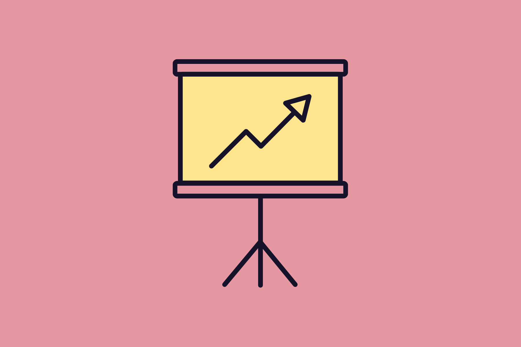
For a data scientist, the best way to tell a story to a wider audience is through visualizations.
What’s data visualization?
In a nutshell, data visualization is presenting data clearly through statistical graphics. Those graphics can vary, depending on the type of information. For example, I might use a bar chart to compare values, such as the performance of various machines in a work cell, but I might choose a line chart to display the change in performance over time. More complex stories may require more intricate visualizations, however, by keeping things simple can often make the most impact.
Data visualization often tells a story better than just numbers.
What’s a cool example?
One of data science’s dirty little secrets is that it can be quite a creative job. Data scientists are getting innovative at showing massive amounts of data in an interesting way. By combining a simple scatter plot with a timeline, this chart by Hannah Fairfield of the New York Times tells a compelling story while keeping it very readable.
Why is it so damn compelling?
Increasingly, we’ve benefitted from data visualization through traditional or social media. Things like infographics, charts, and heat maps can tell an interesting and accessible story through data without using words. The right visualization can stop us in our tracks as we scroll through our Twitter feed. The New York Times, fivethirtyeight, and The Washington Post are examples of organizations that do this particularly well.
There are loads of theories on how the human brain can compare things. Here’s a simple exercise: take two pencils that are similar in length and place them far apart on your desk. Can you tell which one is longer? Now, put them right beside each other. It’s much easier to determine which pencil is longer when they’re right next to each other. Understanding how the human brain makes comparisons helps in designing effective data visualizations.
Sometimes graphs aren’t about the exact numbers. It’s about the relationship or relativity of each factor.
Part of what I try to do is show a complex manufacturing situation in a simple way. I don’t want you to have to go to school to understand it, so it must be accessible. On the flipside, supporting data is always available if you need more information.
How can it help businesses?
Data science not only tells you what’s happened, it can also validate a gut feeling, support the decision-making process, and help you predict what might happen in the future. But this is the key: Data is only useful if you can present it in a way that resonates. Excel spreadsheets are great but don’t get to the point quickly or easily. Visualization tells the story in an effective way. With the right data, it can tell you what happened, why it happened, and what you can do to be better. It predicts the future. Here at Raven, we pick graphics that tell that story.
What’s next for data visualization?
One word: Interactivity. The average person will be able to interact with the plots and charts. While interactive dashboards have been around for a while, it’ll be a new and powerful way for the manufacturing industry to tell stories and then make informed decisions. I’m excited to be a part of it.


